How I Turn One Product Photo Into Store Photos, Try-Ons, and Ad Clips
How I Turn One Product Photo Into Store Photos, Try-Ons, and Ad Clips
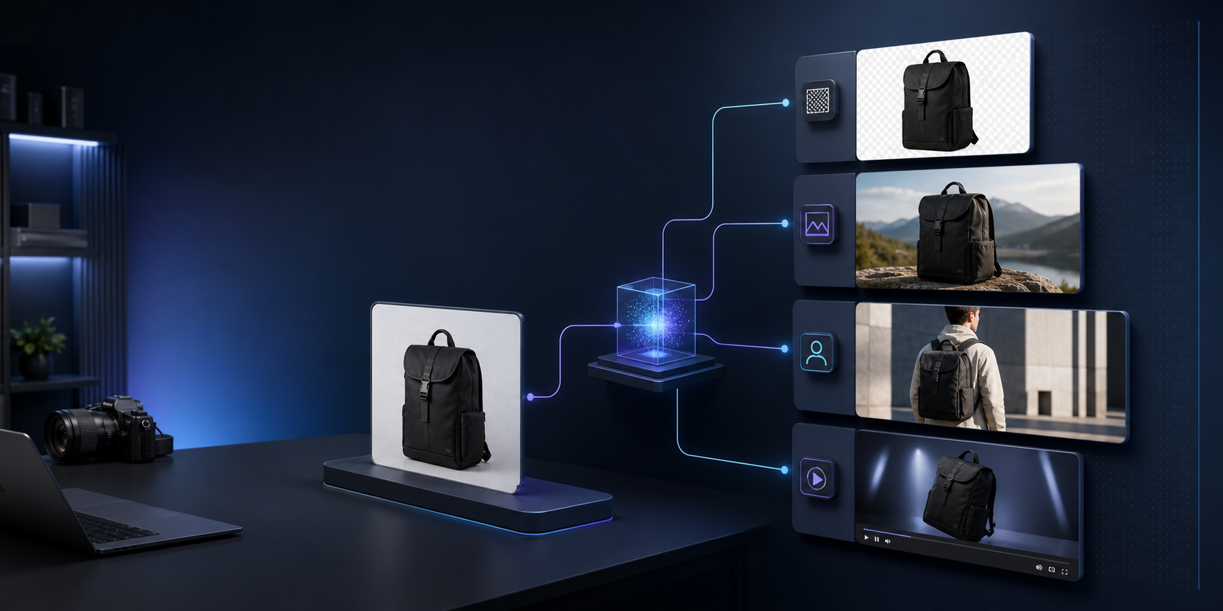
I have a simple test for product-image tools: can I start with one mediocre image and end with a usable asset set without bouncing between Photoshop, a mockup app, and a video tool? That is the workflow I wanted to test with Supra AI Photo Studio, the Shopify app that turns product photos into cleaner studio shots, on-model try-ons, object placement scenes, and short product videos.
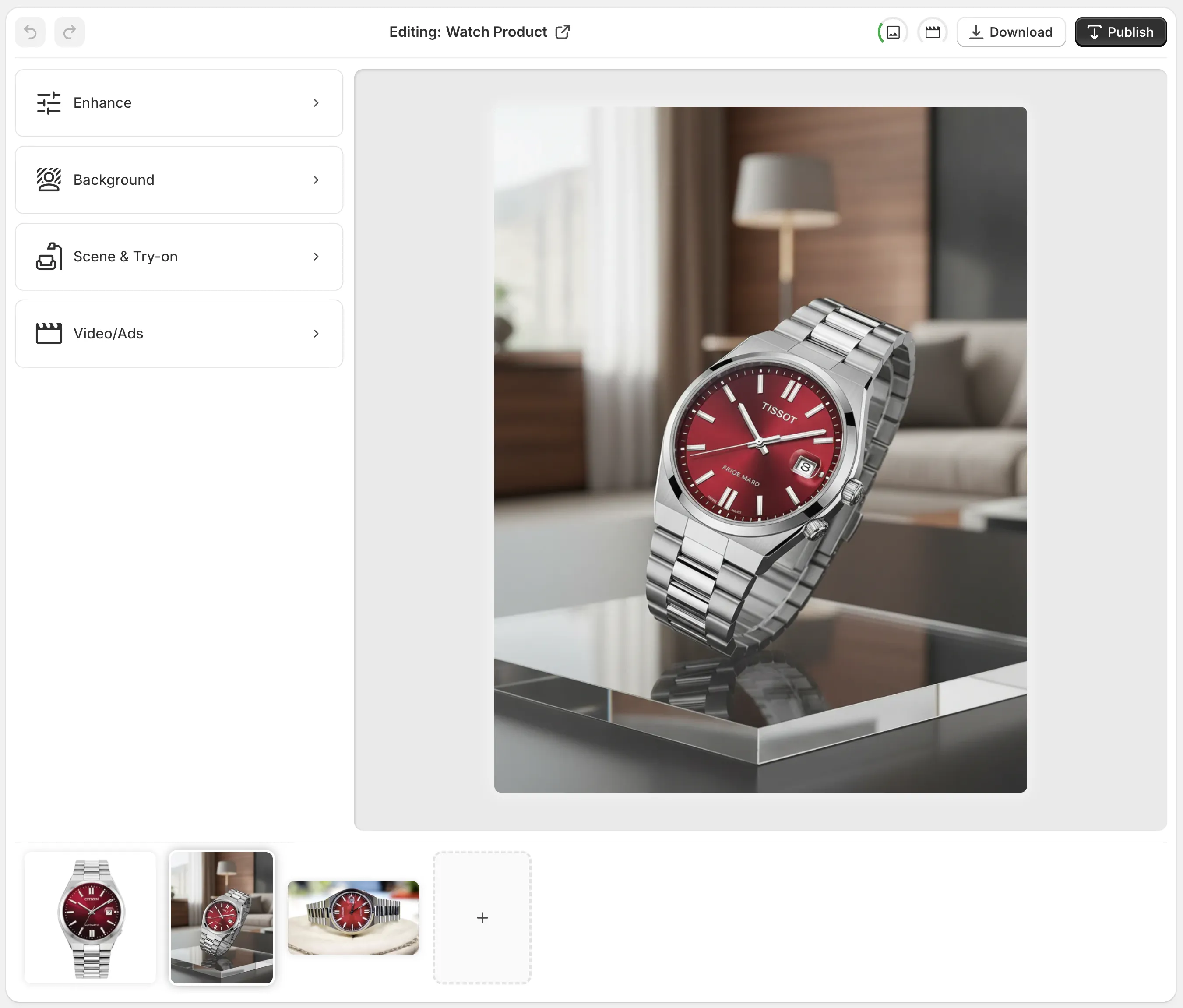
I also wanted to see whether the workflow stayed practical for a real store, not just a demo. The app has a free plan, the Shopify App Store listing is public, and the help center shows the editor as four clear areas: top bar, tools, canvas, and image gallery. That matters because most of the time savings come from not having to think about where the next step lives.
For context, I had already written about How I Build a Shopify Product Photo Pipeline That Feeds Every Channel, How I Turn Basic Shopify Product Photos Into Better Assets, How I Turn One Product Photo Into a Channel-Ready Shopify Asset Set, and How I Decide Whether a Shopify Product Photo Needs Try-On, Placement, or Video. This post is the version where I explain the workflow I would actually keep.
The workflow I actually used
The part that mattered most was the order.
- I started by isolating the product.
- I cleaned up the image with enhancement and upscaling.
- I decided whether the product needed context.
- I only moved to try-on or video when the earlier step had already produced a usable still.
That sequence sounds obvious, but it is the difference between a repeatable system and a pile of one-off outputs. If the base image is still messy, every later edit inherits the mess. If the base image is already clean, the rest of the workflow feels like adding value instead of repairing damage.
The first pass is usually background cleanup and lighting correction. In a store setting, that is the boring work that pays off everywhere: product pages, category tiles, ad variants, and email creatives. If a photo is still unclear after that step, I do not pretend the later tools will magically fix it.
Where the ROI showed up first
The ROI was not in “AI art.” It was in stopping myself from doing the same cleanup work three different times.
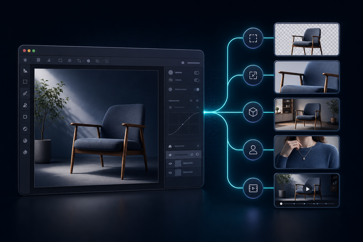
- Flat or messy product photo: background removal and enhancement. I stop when the PDP image looks clean enough to ship.
- Product needed environment context: object placement. I stop when the scene looks believable, not staged.
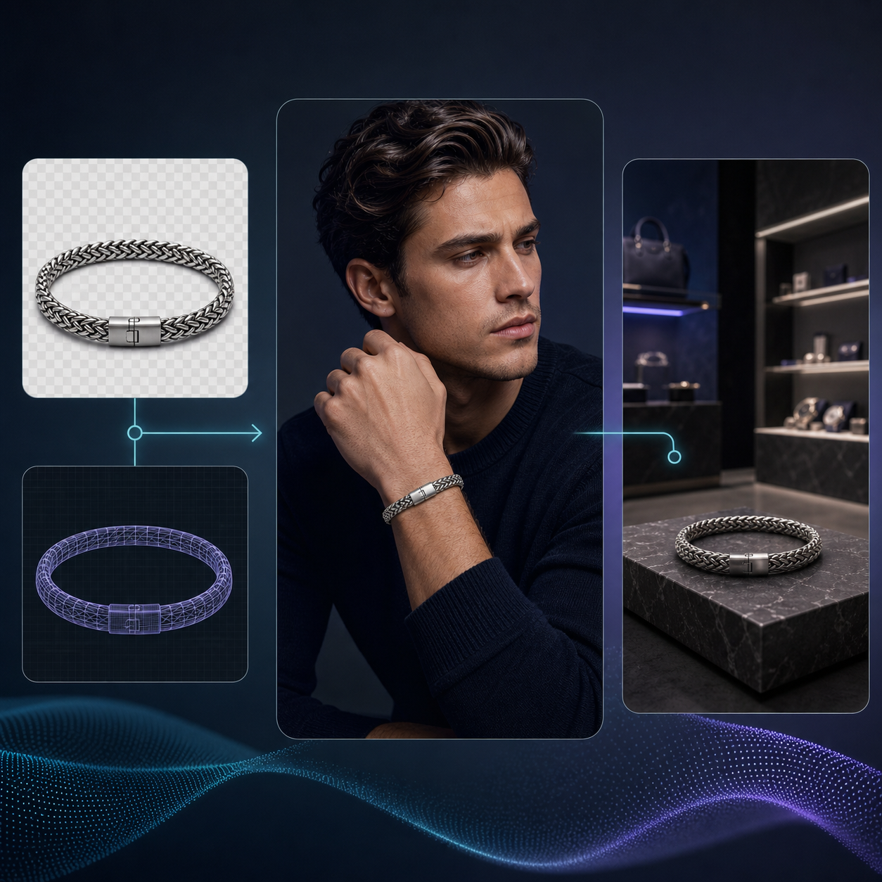
- Apparel, jewelry, or accessories needed a human model: try-on. I stop when the product reads correctly on the model.
- I needed ad-ready motion assets: UGC videos or b-roll. I stop when I have a clip worth testing.
That list is the real reason I would use the app again. It gives me a clean decision tree instead of a “throw everything at the image” workflow.
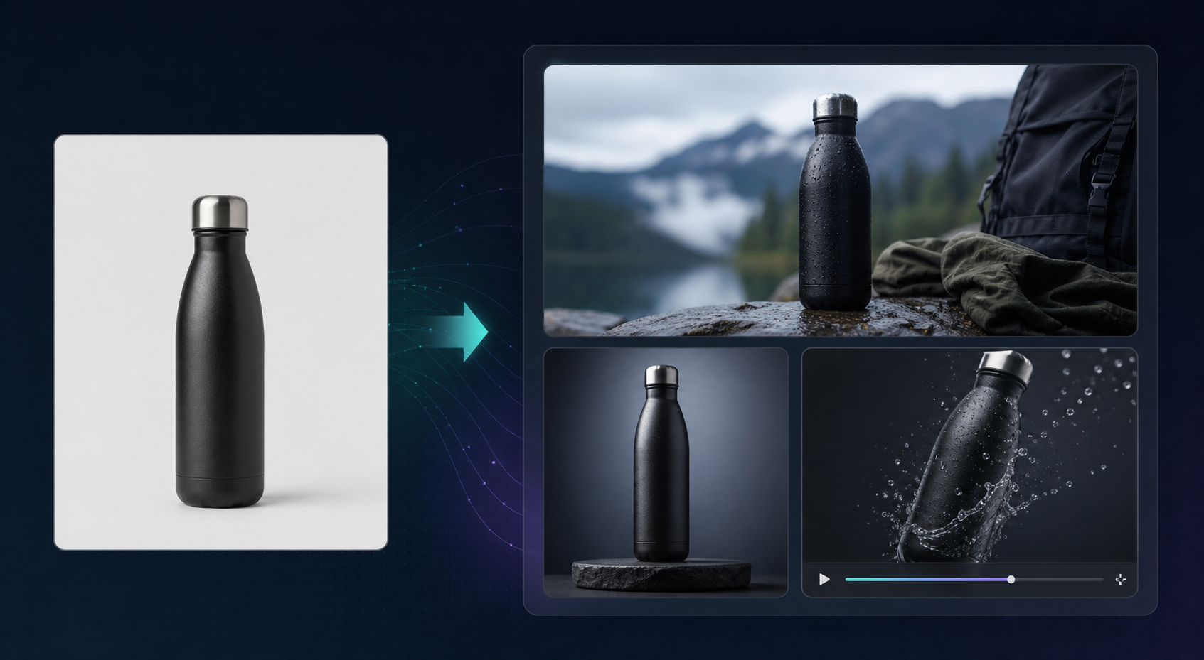
The object-placement feature is the one I would reach for most often after cleanup. For home goods, electronics, and branded accessories, a product in the right environment sells the context faster than a paragraph ever will. That is also where I think a lot of photo tools overpromise. They go straight to dramatic generation. I got better results when I treated placement as a finishing layer on top of a solid product photo.
When try-on makes sense
Try-on is the feature I would save for products where fit, scale, or wearability actually matters.
That means apparel first, then jewelry and accessories, then anything where a customer wants to know how the item sits on a person. It is not the right move for everything. If the product does not benefit from a human model, forcing one in usually makes the result feel less credible.
The best use case is when the product already has strong visual identity, but the merchant still needs one more layer of realism. The try-on path lets me keep the product front and center while giving the shopper enough human context to imagine it on themselves. That is more useful than a generic lifestyle shot that looks pretty but says nothing.
For this part, the article How I Decide Whether a Shopify Product Photo Needs Try-On, Placement, or Video is the closest companion. This post is about the workflow; that one is about the decision.
The part I would keep for a real store
If I were rolling this out on an actual catalog, I would start with three rules.
- Clean the base product image first.
- Use placement for products that need context.
- Use try-on only when the customer needs to understand fit or wear.
If a product still needs more selling power after that, I would test the b-roll or UGC video generator next. The app’s value is not that it replaces every creative task. It is that it lets me keep the same product image moving through more of the funnel without starting over.
That is why the broader pipeline article, How I Build a Shopify Product Photo Pipeline That Feeds Every Channel, still feels like the right mental model. One upload should not just produce one asset. It should produce the cheapest credible version of every asset I know I will need.
Bottom line
Supra AI Photo Studio is most useful when I treat it as a production system, not a novelty generator. The win is not that it makes prettier images. The win is that it turns one product photo into a consistent asset set for the store, ads, and social without making me rebuild the same work elsewhere.
If you want to sanity-check the workflow, start with the Supra AI Photo Studio landing page, skim the Shopify App Store listing, and watch the demo trailer. If the workflow fits your catalog, the free plan is enough to find out quickly.
Then map your own first three steps: cleanup, placement, and only then try-on or video. That order is what kept this from turning into another complicated tool demo.

Comments
Post a Comment