Shopify Swatch Setup Checklist for Variants, Linked Products, and Collections

A reliable Shopify swatch setup starts by choosing the right relationship for each color. Use variants when the colors are the same product with selectable options. Use linked products when each color deserves its own page, inventory story, or imagery. Then make sure shoppers can see the same useful choice on collection pages as well as product pages.
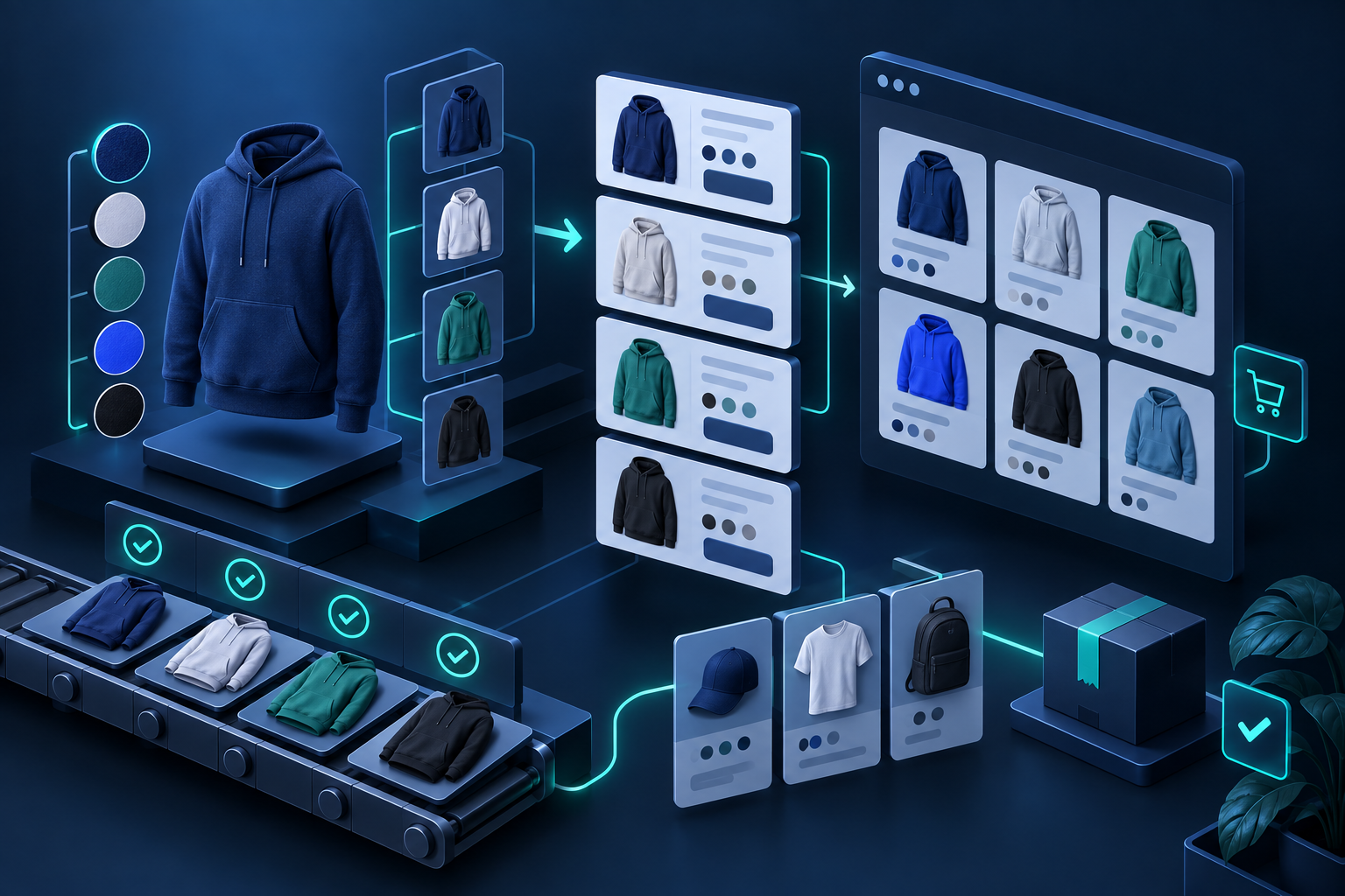
Choose variants or linked products first
Variants work best when size, color, or material belongs to one product record. A shopper can select the option and stay on the same page. Linked products are more useful when a colorway needs separate merchandising, SEO, imagery, or inventory handling. The swatch should make that relationship obvious rather than forcing someone to decode similar titles.
Supra Swatch Colors supports both patterns without theme-code work: it can turn variant options into color or image swatches and link separate product pages into a product group. That means the implementation can match the catalog rather than changing the catalog to fit a dropdown.
Standardize the color source
Pick one source of truth for each swatch. For simple colors, auto-detected colors may be enough. For patterns, finishes, fabrics, or products where the visual matters more than a label, use product images. Avoid mixing approximate color names and unrelated images within the same family.
What you should see after this step is a small, consistent set of swatches that clearly maps to the customer-facing products or variants.

Add swatches where shoppers browse
Product-page swatches help with the final selection, but collection-page swatches can reduce unnecessary clicks. A shopper looking at a category grid can quickly see whether a jacket, mug, or accessory is offered in a useful color before opening several pages.
Check that the collection swatch takes the shopper to the expected variant or linked product. This is especially important when a group contains separate product pages instead of variants.
Test style, language, and loading behavior
Use the app's customization controls to match swatch size, shape, tooltip, labels, and spacing to the store. Then test on mobile. A large desktop swatch row can become awkward when it wraps into a narrow product card.
For multilingual stores, inspect the customer-facing labels in each important language. The visual color chip may work everywhere, but nearby text, tooltips, and product names should still make sense.
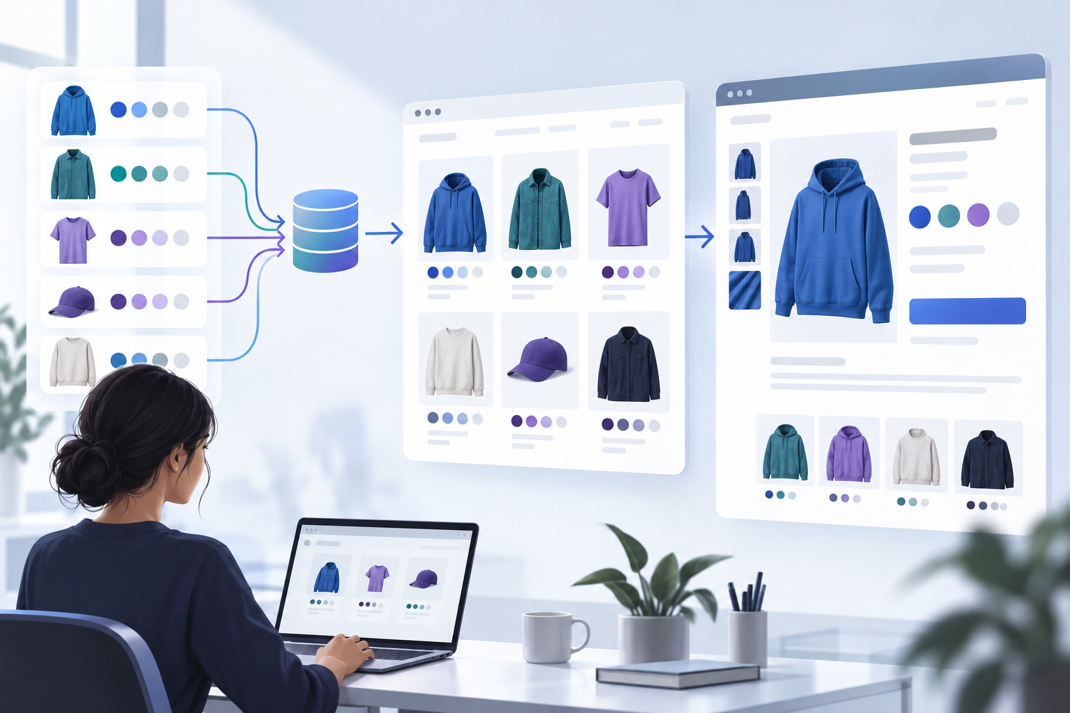
Run a small QA checklist before launch
- Select every visible variant and confirm the correct media and price appear.
- Click linked-product swatches and confirm the destination product is correct.
- Open the main collection page on a phone and a desktop browser.
- Check at least one product with many colors and one with image swatches.
- Confirm the same group does not have duplicate or missing color choices.
This takes less time than fixing customer confusion after a collection update. Once the first group is clean, reuse the setup pattern across the catalog instead of rebuilding each product by hand.
Next step
Choose one high-traffic product family, decide whether it should use variants or linked products, and add the swatches to both the product and collection experience. A small, tested rollout gives you a repeatable way to make color choices faster for shoppers and easier to maintain for the team.

Comments
Post a Comment