When Should a Shopify Color Be a Separate Product Page?

# When Should a Shopify Color Be a Separate Product Page?
A Shopify color should stay a variant when it is the same product with the same buying context: same description, same product story, and mostly the same media. Make it a separately linked product when that color needs its own gallery, positioning, inventory story, or discoverable landing page. The goal is not more catalog structure; it is a color choice that helps shoppers decide without splitting your team’s workflow.
Shopify supports options and option values for creating variants, and its documentation notes that the option name and values are visible to customers. That makes naming and structure a storefront decision, not just an admin detail. Supra Swatch Colors can present either variant colors or links between separate products as visual swatches, so the storefront choice does not have to dictate one rigid color architecture.
Start with the customer’s next click
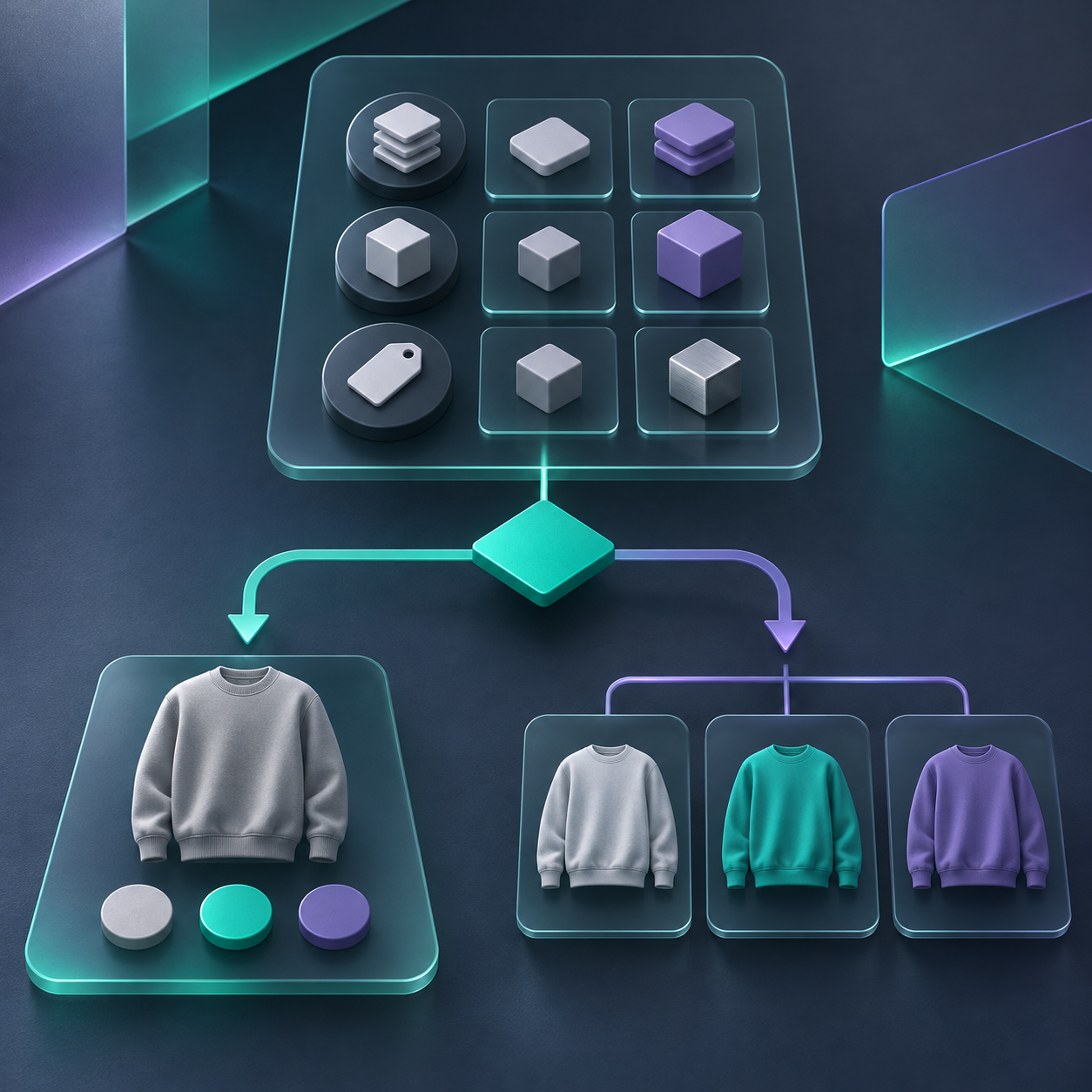
Ask one question before creating another product: after a shopper changes color, should they still be evaluating the same product page?
Use a normal variant if the answer is yes. A navy tee in the same fit, fabric, price band, and photo treatment is usually one product with a color option. A standard variant keeps the customer in one decision flow and lets your team manage related stock together. Shopify’s variant guide describes variants as different option combinations for one product, such as size and color.
Use a separate product if the answer is no. For example, a Stone modular sofa with different upholstery photography, a different lead time, and a design-focused description is not merely another chip on the same page. It may deserve a page that can carry its own narrative, images, merchandising, and search intent.
| Signal | Keep it as a variant | Make it a linked product |
| --- | --- | --- |
| Core item | Same construction and promise | Different configuration or buyer use case |
| Product imagery | One shared gallery works | Needs a dedicated hero/gallery |
| Product copy | One description explains all colors | Material, story, or specifications change |
| Merchandising | One collection card is enough | Each colorway should be found and merchandised separately |
| Operations | One SKU family is easy to maintain | Different fulfillment, price, or availability rules need separation |
This distinction also protects your catalog from a common failure mode: using variants because the products look related, then forcing one page to explain products that actually require different evidence.
A five-minute color architecture check
Before you bulk-edit anything, take one representative product family and review these five points:
1. Compare the product promise. Write a one-sentence buyer promise for each color. If the sentence changes beyond the color name, flag it for separate-page review.
2. Check the first four images. If each color needs a different lead image, material close-up, or in-room context, a linked product is often clearer.
3. Check inventory and price exceptions. A different price, preorder state, or lead time does not automatically require a separate product, but it is a warning that the shopper’s decision is becoming distinct.
4. Check collection behavior. Decide whether a shopper browsing a category should see one card or several. This is especially important for collections that use color as a browsing shortcut.
5. Check the return path. When a shopper clicks a color, can they easily see sibling options and return to the family? If not, the catalog may be technically correct but difficult to navigate.
If the product family crosses three or more linked-product signals, treat a separate page as the default hypothesis. Then test the shopper experience, rather than making the decision from the admin alone.
Avoid confusing linked products with Shopify Combined Listings
Separate linked products and Shopify Combined Listings solve adjacent problems, but they are not interchangeable. Shopify says Combined Listings connects individual products into a single enhanced listing and is available to Plus and enterprise commerce plans; it also has theme-compatibility and feature considerations.
That can be useful for stores that qualify and need Shopify’s native combined-listing model. But a smaller store may simply need clear product pages connected with visible color swatches. In that situation, a swatch layer that can link products gives customers the visual continuity of a color picker while keeping each product page independent.
The important operational rule is to choose one source of truth for the relationship. Do not create a loose network of manually linked products, overlapping variant names, and a second grouping method without documenting which system is authoritative.

Set up swatches after the catalog decision
Once the underlying product structure is right, configure the storefront. Supra Swatch Colors supports color and image swatches, variant colors, linked products, and swatches on product and collection pages. Its app listing says it uses Shopify App Embeds, so it is designed to avoid editing theme code directly; still, preview your theme and keep a rollback point for any storefront change.
A practical rollout looks like this:
1. Normalize the customer-facing color labels first. Ocean Blue, Blue Ocean, and Ocean should not represent the same choice in different places.
2. Configure one test family with the final labels and swatch treatment.
3. Preview the product page on desktop and mobile.
4. Check the collection grid, including sale badges, sold-out states, and quick-add behavior.
5. Only then extend the pattern to similar families.
This builds on the idea behind standardizing Shopify color names before adding swatches: the visible chip is only as clear as the product data underneath it.
Test the experience where customers browse
Do not stop at a successful product-page click. Use a small release check that covers the routes shoppers actually take:
- From a collection page, select a swatch and confirm the expected product or variant opens.
- Confirm the selected color is visually obvious after the page loads.
- Test an out-of-stock color and make sure its state is understandable.
- Test one phone-sized viewport; swatch controls can become cramped long before the desktop layout shows a problem.
- Search for both a family term and a color-specific term to see whether your catalog structure matches your discoverability goal.
For a more focused collection-page check, this guide on making collection pages easier to scan with color swatches is a helpful companion. And if your catalog is moving from variants to a family of separate products, use the linked-product swatch migration checklist before changing a large group at once.

Make the decision repeatable
Create a short internal rule: variants represent the same purchase decision; linked products represent connected but independently merchandised decisions. Put that rule in the intake sheet for every new color launch. It will prevent the catalog from drifting toward either extreme: one overloaded page with unrelated choices, or dozens of near-duplicate pages with no way to move between them.
If you want the visual layer to support either path, start a Supra Swatch Colors free trial. Build one representative family, check it across the product and collection pages, and then scale the pattern that makes the customer’s next click obvious.

Comments
Post a Comment