How To Add Color Swatches On Shopify Collection Pages Without Code
If your shoppers must click into every product just to see available colors, you’re losing time, trust, and conversions. The fix is simple: add color swatches directly to your collection (category) pages—no code, no theme edits, just a clean, instant upgrade to your store’s UX.
In this guide, you’ll learn exactly how to add no‑code, blazing‑fast collection page swatches using Supra Swatch Colors, a highly customizable swatch app that works across all themes and multilingual stores.
What are collection page color swatches—and why they matter
- At‑a‑glance discovery: Shoppers can preview every available color from the grid view.
- Fewer clicks, faster decisions: Reduce product page bounces and increase add‑to‑carts.
- Cleaner merchandising: Showcase your full palette without duplicating thumbnails.
- Measurable lift: Better UX on index pages often correlates with improved conversion rate and time on site.
No-code solution: Supra Swatch Colors Supra Swatch Colors adds instant, customizable swatches to both product and collection pages—without touching your theme code.
Highlights:
- Works with built‑in variants or by linking separate product pages via color swatches
- 20+ customizable styles (size, shape, tooltip, labels, fonts, borders)
- Auto‑detects store colors or use product images for swatches
- Loads instantly and supports all themes + multilingual shops
- Scales to thousands of products and swatches
Start here: Install Supra Swatch Colors
- Install on the Shopify App Store: https://apps.shopify.com/swatch-colors-ultimator
- Learn more: https://supra-swatch-colors.sktch.io/
Watch a quick intro (2 min):
- Supra Swatch Colors — Shopify App to add Color Swatches to Products: https://www.youtube.com/watch?v=k8uyugxH9To
Step‑by‑step: Add swatches to collection pages (no code) 1) Install the app
- Go to https://apps.shopify.com/swatch-colors-ultimator and click Add app. Approve permissions and open the app in your admin.
2) Enable collection page swatches
- In the app’s dashboard, find Collection page integration and toggle it on. No theme edits required—the app auto‑injects swatches for supported themes.
3) Choose your source method
- Variant Colors: If your products have a Color (or similar) variant option, select Swatches for Variants. The app maps variant values (e.g., Black, Navy) into color or image swatches.
- Linked Products: If you use separate product pages per color (e.g., “Sneaker – Black,” “Sneaker – White”), choose Swatches for Linked‑Products. You’ll group related products so each color appears as a swatch on the main product tile.
4) Style your swatches (20+ presets)
- Choose size (S/M/L), shape (circle/square/pill), border/outline, and hover states.
- Toggle tooltips (helpful on mobile), and set label styles (font, weight, case).
- Align swatches under product cards and set how many to show before the “+” overflow.
5) Auto‑detect or assign visuals
- Auto‑detect Colors: The app identifies color values from your store and applies them automatically.
- Image Swatches: Map variant images or upload swatch images when fabric/pattern realism matters.
6) Test across devices
- Preview a collection page on desktop and mobile to confirm placement, spacing, and tap targets. Adjust line breaks, row gaps, and tooltip behavior as needed.
7) Publish and measure
- Go live and watch product grid engagement improve. Track clicks on swatches, product views, and add‑to‑carts.
Real example: Swatches on collection pages

Variant Colors vs. Linked Products (which is right for you?)
- Use Variant Colors when each color is a variant on a single product page. Pros: unified reviews, consolidated inventory, simpler analytics. Great for apparel, accessories, and home goods.
- Use Linked Products when each color deserves its own page (unique descriptions, images, price points, or SEO). Pros: precise merchandising and keyword targeting for each color. Perfect for footwear, furniture, or collections where each finish is a hero.
Either way, Supra Swatch Colors supports both methods—so you can mix strategies across your catalog.
Advanced customization tips
- Material‑accurate swatches: For textured items (knit, suede, terrazzo), prefer image swatches for realism.
- Accessibility first: Enable tooltips and labels for clarity; ensure sufficient contrast on borders and selection states.
- Overflow logic: If you have 10+ colors, show 5–7 swatches and collapse the rest under a “+” counter to keep grids tidy.
- Consistent naming: Standardize your variant name (e.g., Color) and values (e.g., “Light Blue,” not “Lt Blue”) to improve auto‑mapping.
- Global styling: Use a preset to keep swatches consistent across collection and product pages for brand cohesion.
Performance and compatibility
- Instant load: Swatches render with minimal overhead to preserve page speed.
- Works on all major Shopify themes and multilingual stores—no fragile theme edits.
- Scales to thousands of products and swatches without tangling your admin.
Helpful videos
- Getting Started — Tutorial: https://www.youtube.com/watch?v=K_2l9G1ibIo
- How to Link Products with Color Swatches: https://www.youtube.com/watch?v=H9LOX-vOjYI
- How to add Swatches on the Collection pages: https://www.youtube.com/watch?v=FKZQpBrAJQQ
Why choose this no‑code approach over alternatives
- No theme edits required: Avoid breaking layouts during updates.
- More customization: 20+ style combinations vs. rigid default options elsewhere.
- Full coverage: Works on both product and collection pages, with multilingual support.
- Faster rendering: Snappy UI that keeps your Core Web Vitals happy.
Quick checklist before going live
- [ ] Confirm swatches appear under every relevant product on collection pages
- [ ] Verify hover/click behavior on desktop and tap behavior on mobile
- [ ] Ensure tooltips/labels are readable and localized
- [ ] Test both variant and linked‑product workflows (if used)
- [ ] Spot‑check performance on high‑traffic collections
Troubleshooting (fast fixes)
- Swatches not showing on a collection page? Ensure the collection page integration is toggled on inside the app and your theme is published/active. Then clear theme cache and hard‑refresh.
- Some products missing swatches? Check that the variant option is named consistently (e.g., Color) or that linked product groups are correctly assigned.
- Patterned swatches look blurry? Upload higher‑resolution swatch images and reduce compression.
- Crowded grids? Reduce swatch size or show fewer visible swatches with the “+” overflow.
Add swatches now (free to try)
- Install Supra Swatch Colors: https://apps.shopify.com/swatch-colors-ultimator
- Explore features and docs: https://supra-swatch-colors.sktch.io/
Turn your collection pages into decision‑making machines. With Supra Swatch Colors, you’ll add beautiful, accessible, and performance‑friendly color swatches—no code, no headaches, just better shopping.
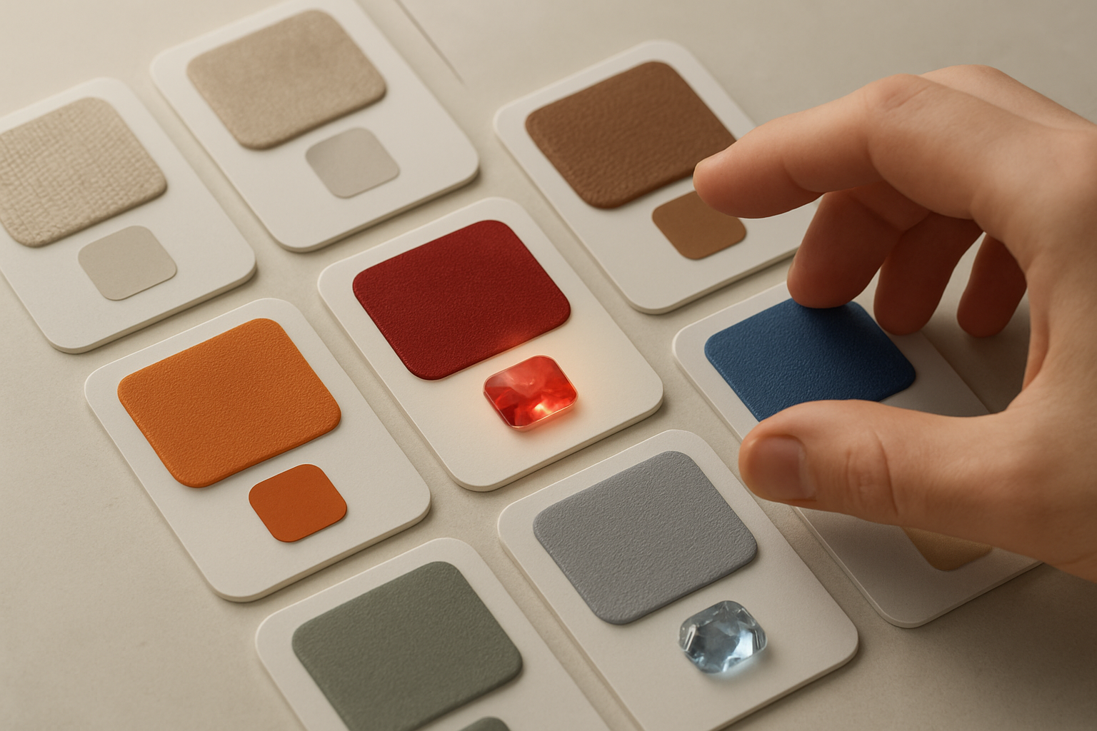
Bonus: Total visual control

Ready to ship this upgrade today? Install in minutes: https://apps.shopify.com/swatch-colors-ultimator


Comments
Post a Comment